Vodafone · via Amdocs
Vodafone - Billing Suite
Large-scale telco products across platforms, turning dense billing data into something customers could actually read.

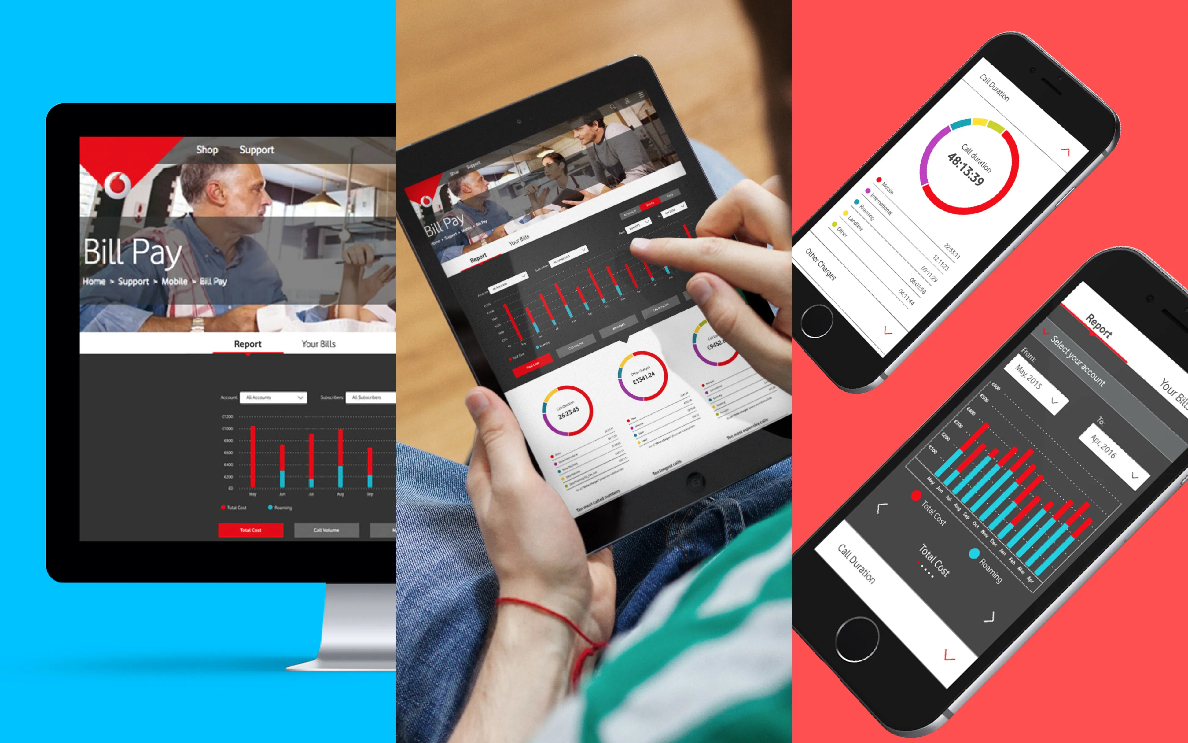
- Millions Of users served worldwide
- Multi-Platform Desktop, tablet and mobile
- Billing Clarity Reduced customer-service dependency
The Brief
Context
As Senior UX Designer at Amdocs, I partnered closely with Vodafone to design a suite of products spanning multiple platforms: telco experiences used by millions of people worldwide.
Read the detail
Responsibilities
- Design across a portfolio of Vodafone products and platforms.
- Make complex billing information genuinely easy to understand.
- Hold a consistent visual standard across a large product family.
Telecoms products carry enormous complexity: plans, usage, charges and account states that have to make sense to every kind of customer. Working within Amdocs' large telco practice, I focused on bringing clarity and a strong visual standard to Vodafone's customer-facing products.
Discovery
Understanding the billing problem
Billing is where telco customers get confused, and confusion drives calls to support. I dug into how customers read their bills and where the existing presentation let them down.
- Mapped how customers interpret usage and charges.
- Identified where dense data created confusion and support calls.
- Targeted the moments with the biggest clarity payoff.
Data Visualisation
Billing data, made legible
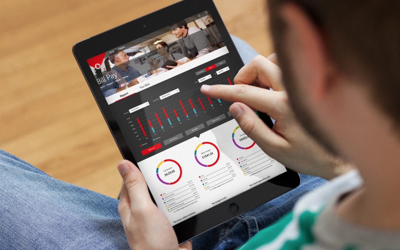
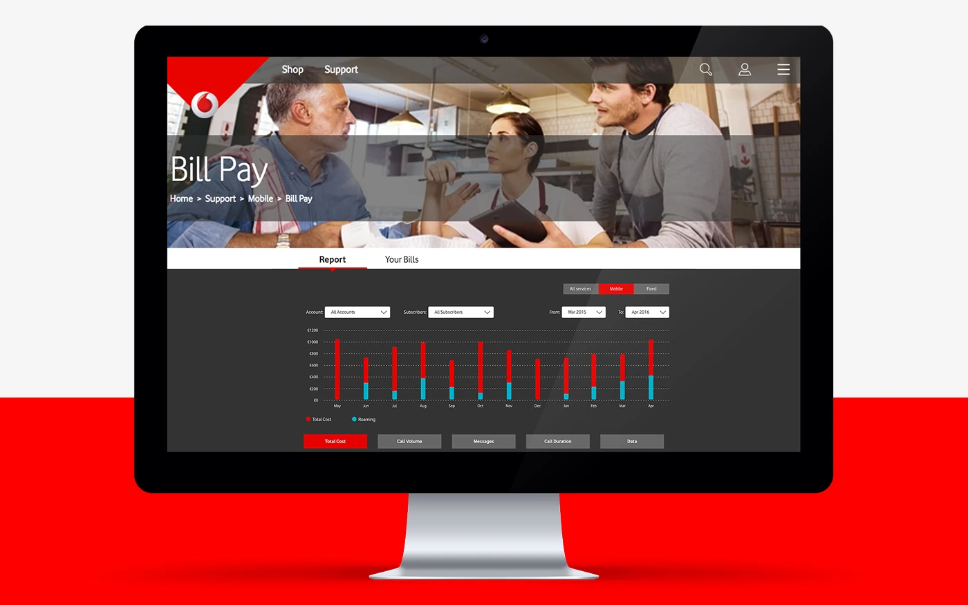
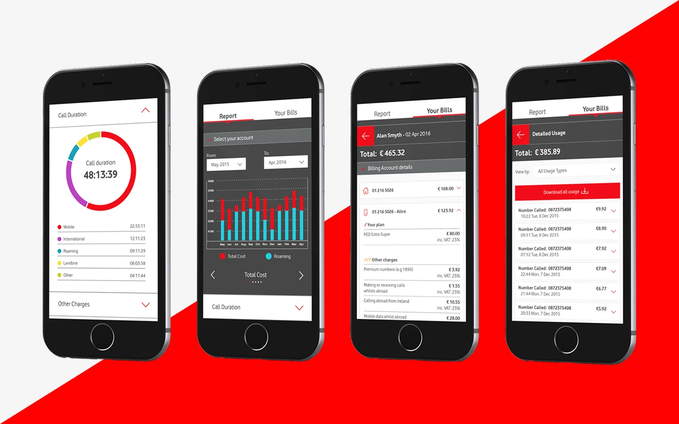
I improved how billing data was visualised, restructuring dense figures into clear, scannable views that reduced customers' reliance on customer service to understand their accounts.
- Reworked billing and usage into clearer visual hierarchies.
- Designed data visualisations that answered questions at a glance.
- Reduced dependency on customer service to interpret bills.
Read the detail
Good data visualisation isn't decoration; it's the difference between a customer answering their own question and picking up the phone. By giving usage and charges a clearer visual structure, the products did more of the explaining themselves.
Impact
Outcome
The work delivered clearer, more consistent Vodafone products across platforms, with billing experiences that reduced customer-service dependency.
- Clearer billing and usage experiences for millions of customers.
- A consistent visual standard across the product family.
- Reduced reliance on support to interpret account information.