PartnerRe
PartnerRe - HARP
A blue-sky internal product for PartnerRe's health insurance team, bringing spreadsheets, client management, expenses and reporting into one place, designed from conception to launch.

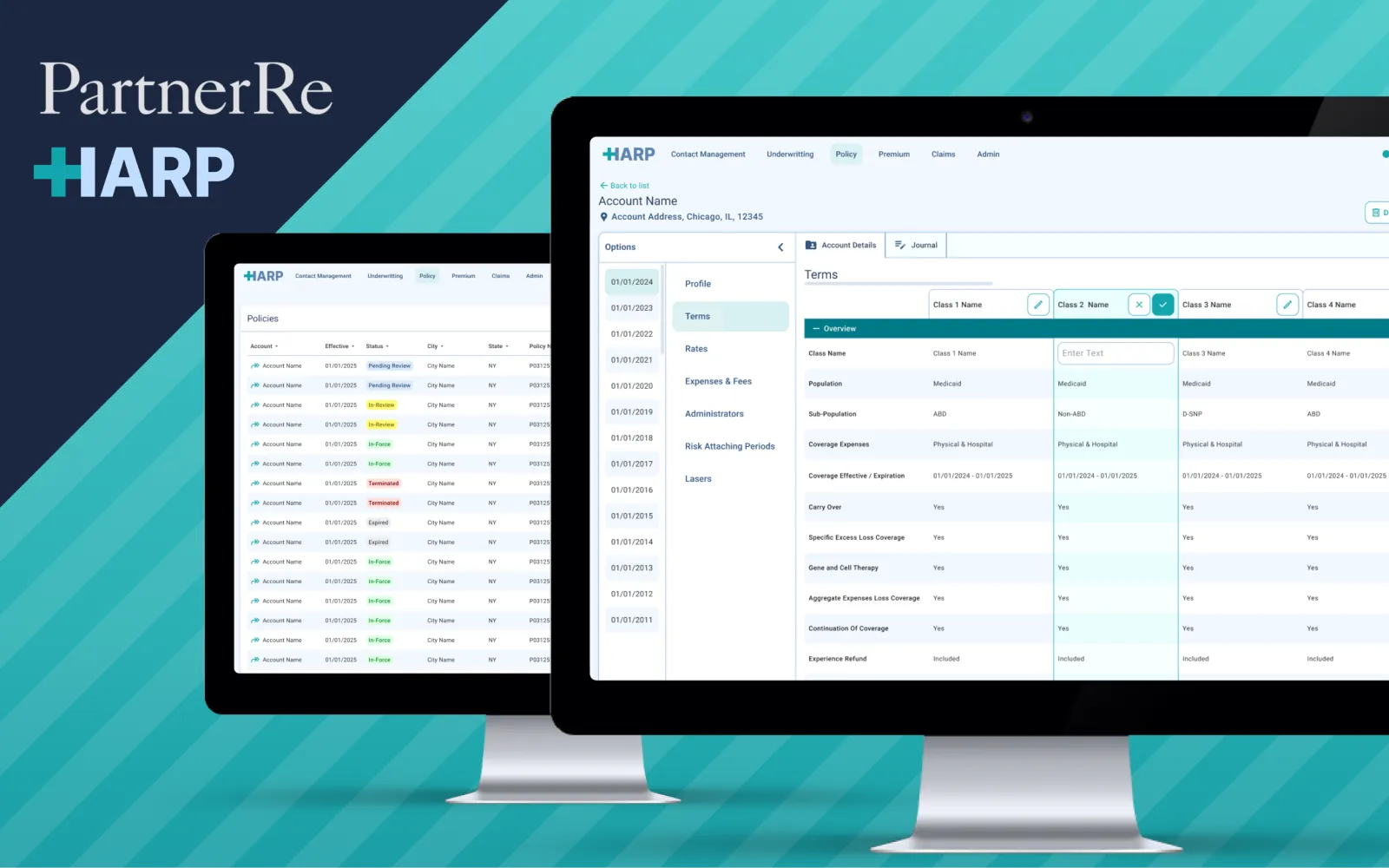
- Blue-Sky Product Designed from conception to launch
- Health Insurance Built for PartnerRe's health team
- Legacy Apps Retired Replaced dated and third-party tools
- Design & Code Lead designer and Lead UI Developer
The Brief
Context
After launching UWIN, my contract was extended to design a second, entirely new product for a different team. HARP gave PartnerRe's health insurance team one place to build spreadsheets, manage clients, track expenses and produce reports.
Read the detail
Responsibilities
- Design a new internal product for the health insurance team, end to end.
- Bring spreadsheets, client records, expenses and reporting workflows together.
- Facilitate the retirement of multiple legacy and third-party tools the team relied on.
The health team's day-to-day work was spread across outdated systems with poor usability and limited capability. HARP's product owners had been at PartnerRe for years and knew exactly where the friction was, which gave me a clear vision to design towards. Because HARP was a blue-sky product, there was no existing model to follow. Principles, guidelines, components and interaction specs all had to be defined as the product itself took shape.
Structure
Mapping the health team's workflows
I started with the product owners, building IA models, sitemaps and workflow diagrams around how the health team actually handled clients, spreadsheets and expenses, then turned those into low-fidelity wireframes.
- Mapped IA models, process flows, sitemaps and user flows.
- Developed personas for the different roles using HARP.
- Reviewed wireframes with the delivery team in regular workshops.
Read the detail
Each round of flows fed back into the team's understanding of the functional spec, which in turn let me refine the architecture. That loop continued through the wireframe stage until there was enough shared context to move confidently into UI. Understanding what the legacy tools did well mattered as much as what they did badly. Keeping what worked and dropping what didn't made it possible to introduce better workflows without losing anything the team depended on.
Output
Designs delivered
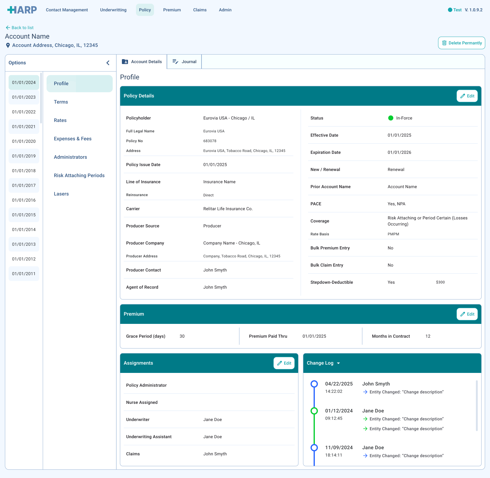
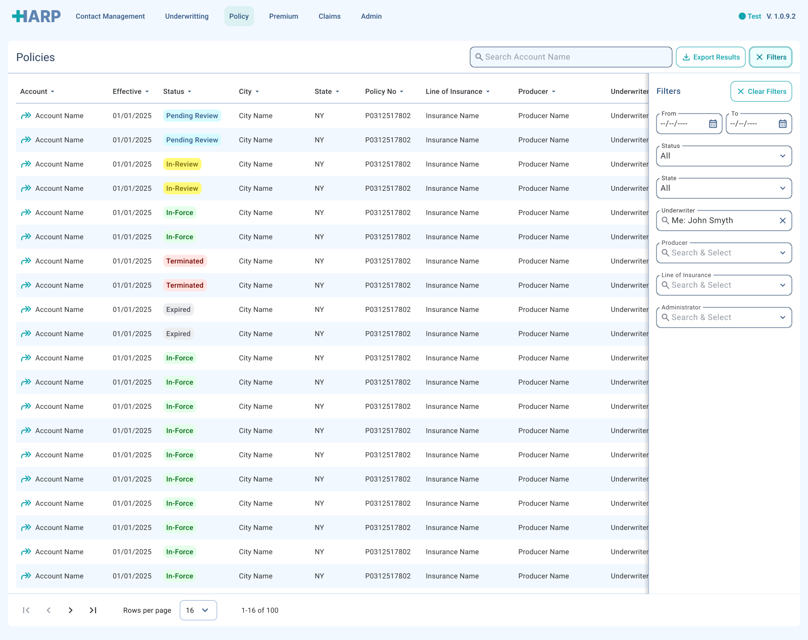
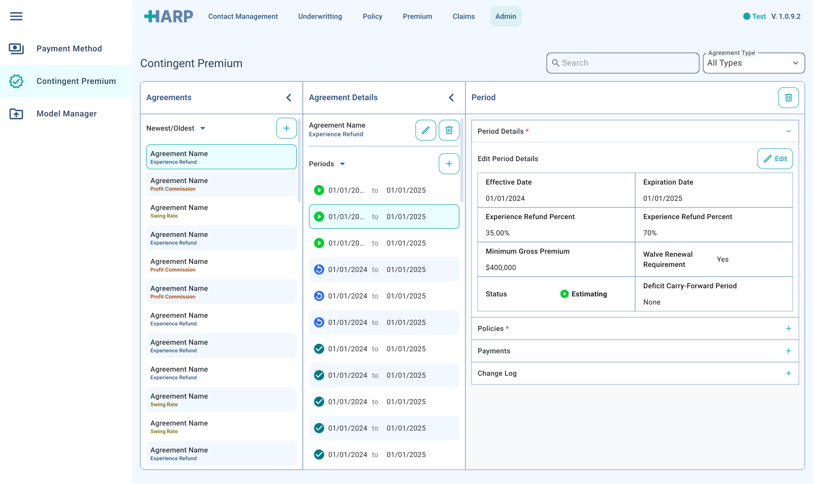
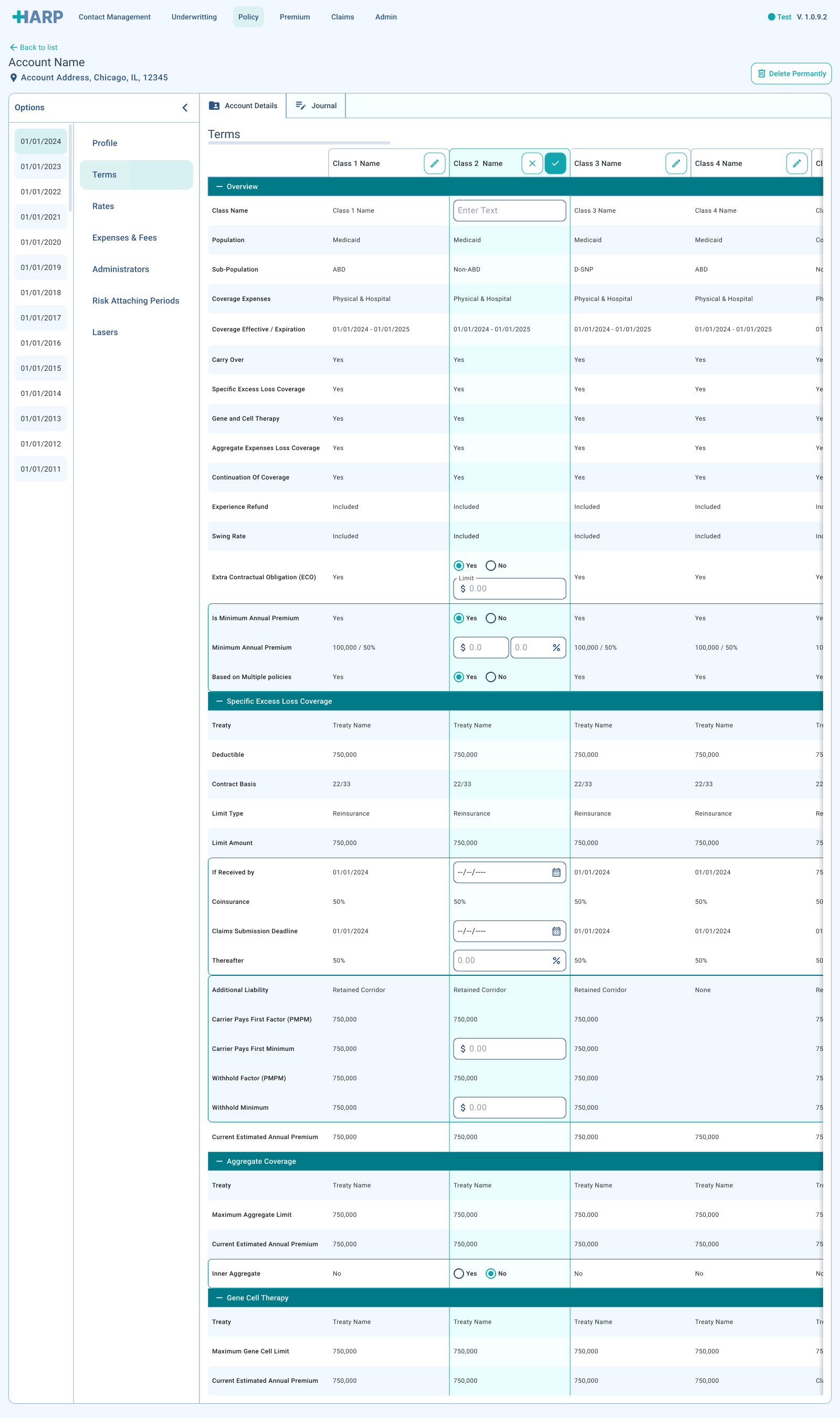
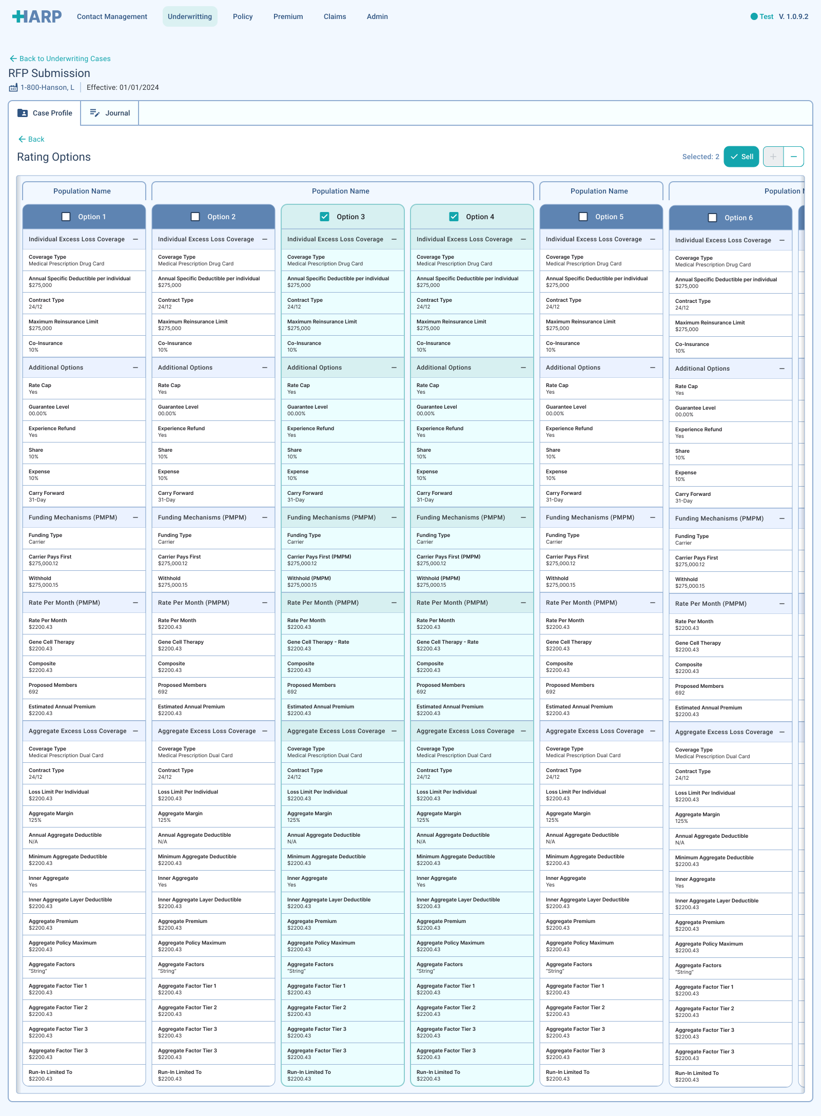
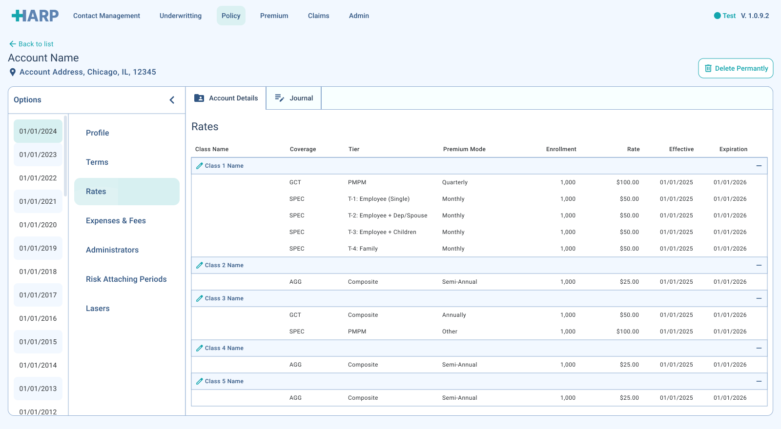
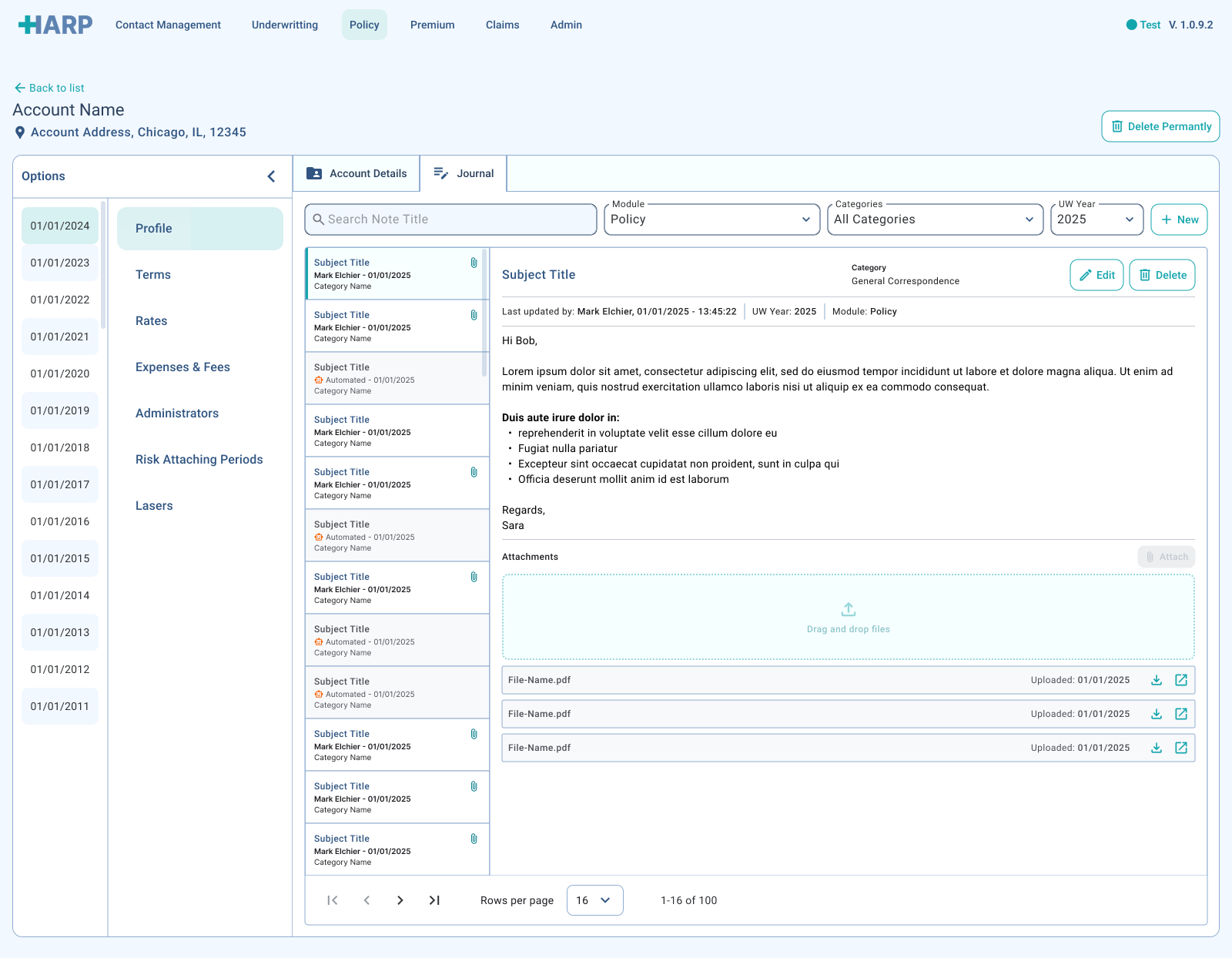
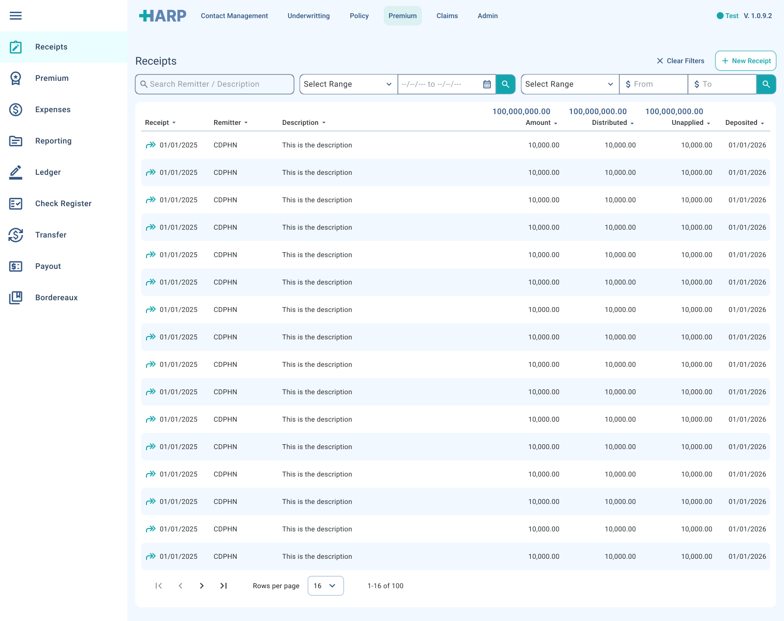
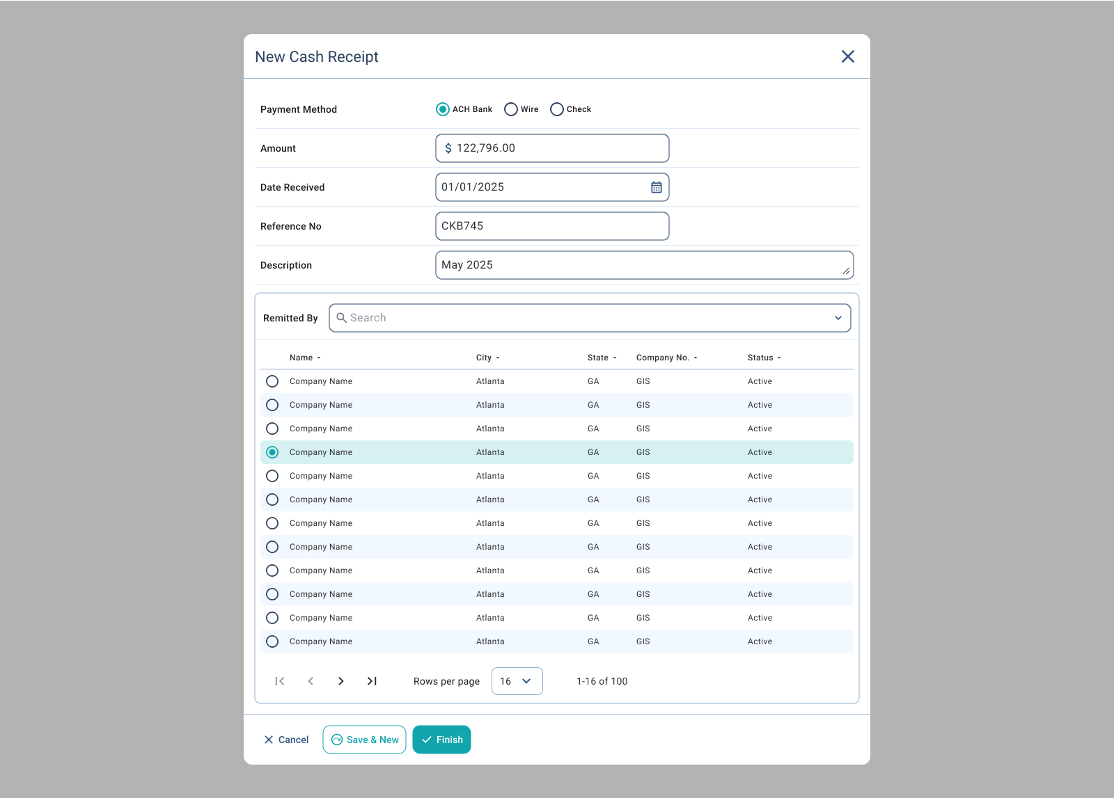
A selection of HARP's final screens, from in-app spreadsheet creation and client management to expense tracking and reporting. Each was built from the product's own design system and refined through testing with the health insurance team.

Systems
A design system, from Figma to code
HARP needed its own design system, built in step with the product. I prioritised the components my wireframes relied on most, turned them into full-fidelity assets, and then helped write the front-end code that brought them to life.
- Built a component library with guidelines, states and CSS references.
- Acted as Lead UI Developer, coding the SCSS libraries and HTML templates.
- Set up handoff, reviews and change requests through DevOps.
Read the detail
Foundations for type, colour, effects and patterns grew alongside the first screen designs, so user testing and development could start before the design phase was finished. As sole designer, I owned the system's governance too. Working with the full-stack developers and scrum master, I established a standardised design-to-development process within each sprint, using Angular, Material and Bootstrap to keep the code and the designs in sync.
Validation
Testing with the health team
I ran qualitative usability sessions with employees across HARP's personas, A/B testing competing solutions to the same problem and using what we learned to steer the design.
- Led interview-style sessions with internal users.
- A/B tested alternative approaches to key tasks.
- Balanced ambitious ideas against scope and cost.
Read the detail
Some proposals were out of reach for the release in hand, whether because of cost or development effort. Rather than stall, I parked the more ambitious ideas and delivered pragmatic wins first, keeping the product moving while leaving room to return to them later.
Impact
Outcome
HARP launched to PartnerRe's health insurance team to a very positive reception, replacing a patchwork of legacy and third-party tools with a single product built around how the team works.
- Legacy and third-party applications retired, cutting cost and reliance.
- Everyday tasks made faster and simpler for the health team.
- A design system in both Figma and the codebase, ready to scale.